Welcome to the New A Group Site
By The A Group

Welcome to the new A Group site! After launching 27 client sites this year, we decided to show ourselves a little love and rebuild The A Group site. The refreshed content and look is designed to make it easier to discover what we do, find and use our collection of marketing and technology resources, and get in touch with us.
Michael, our senior web designer and the man behind the curtain, explains why he designed the site the way he did, and how it reflects the overall trends in modern web design.
-
We started the site with a "mobile-first" mindset, first considering how it would look on a mobile device like a phone or iPad rather than starting with a desktop design and adapting that for a mobile device. This recent shift in design focus stems from the fact that 63% of adults say they use their phones to access the internet.
A mobile-first mindset leads to many specific design techniques:
-
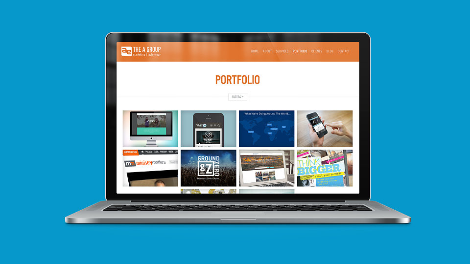
Of course, first priority is making the site responsive, meaning it adapts to the screen size on which it's being viewed. To see it in action, try dragging the corners of your browser window to change the size and watch the site shift to fit.
-
Next, minimalism is king. Not only is a busy site difficult to read on a smaller screen, but it takes too long to load. This is why we see more flat design today compared with dimensional design of several years ago.
-
Warmth comes from color and type rather than from effects. To keep a minimal design from being cold, we relied on images with strong colors and inviting typefaces to make the site attractive. We like to call it "warm minimalism".
-
Finally, the carousel gets cut. Until the last year or two, one of the most common features of a home page was a rotating feature that highlighted happenings, key projects and other recent events. Now, with a mobile-first mindset, we see sites with simple sections and more scrolling, since it's easy to scroll down on phone but much more difficult to flip through a carousel.
-
-
Messaging-wise, we start with a clear brand/overview statement above the fold that tells people who we are before diving into details such as our portfolio or method. First, audiences have to understand who an organization is before they can engage with the details of what they do, and this is a strong branding benefit of removing the rotating feature.
-
And of course, we moved our site to the latest version of TAG Tools, a powerful proprietary CMS that makes it easy for anyone in the office to update the site.
Our talented technology team puts this same brainpower and expertise into all sites we build, and we hope the TAG site is an example of how great web design can improve your audience engagement. What do you think of our new look?

Sign up to receive news, resources, and helpful content, sent straight to your inbox.
More Posts

The #1 Social Media Sin

How to Write a Compelling Appeal Letter to New Audiences

Leveraging Influencer Marketing on a Budget
Why Competent People Often Sabotage Their Organization's Initiatives
Finally! Easy to Create Landing Pages

Landing Pages: The Secret Ingredient to 2024 Marketing Success

Leaders, If Your Digital Strategy is Failing, It Might Be Your Fault
Navigating New Challenges: How to Cultivate Confidence and Competence
Fighting Pessimism: My Daily Struggle to Stay Positive

Outsource or Hire an In-House Team: Every Small Org's Dilemma
Navigating the Wave of Trends: Strategies for Staying Above Water