How to Make a Donation Page That Actually Converts
By Kristen Shoates

You’ve run a compelling donor campaign, gotten people to your site and inspired them to click over to your Giving page. But you haven’t crossed the finish line yet.
Even after someone lands on your donation page, they still need to be convinced to go through with the gift. They use how the page looks to verify other information they’ve seen from you; they seek out information to build trust and confirm financial accountability; and they can easily be turned off by a page that’s too difficult to access or requires too much time to give. At this point in the process – the final point – it is still on your shoulders to help them make a decision and be moved to action.
Though most giving pages might not look too elaborate, there are actually very strategic elements and visuals that can make or break whether you seal the deal. Read on for the practical dos and don’ts of donations pages that actually convert.
DO:
- Include the giving form directly on the giving page
- Use a larger font so donors of all ages can read the page.
- Tell your story on the giving page; include a beautiful photo and a sentence or two about why gifts make a difference.
- Make it easy to access financial accountability information from the giving page.
- Include a link to FAQs, for the donor to verify information.
- Include contact information on the giving page; be sure to list a direct email and phone number (don’t make people fill out forms or submit their personal information to get in touch).
- Make it easy to give monthly - include a one-time or recurring option on the giving form.
- Make the Give button large and in charge, visually calling it out from the rest of the page.
DON’T:
- Make people make multiple clicks or choice in order to give.
- Start your gift array too low; start at $25 and always include an “other” field.
- Clutter the page with too much secondary information; keep the account login, giving options and other links easily accessible but in sidebars or away from the main content.
- Make it too difficult for people to give. Keep forms as short as possible and make logging in or creating an account optional.
- Use inconsistent visuals. If your appeal and your giving page, or if your general giving and project/missionary pages all look different from each other, it can break trust or make things difficult to find.
So what does a perfect giving page look like in our world? Check out the sample below and see how many of these elements you can spot in it.
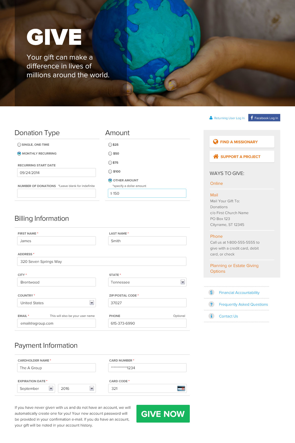
Then compare it to your page to see how you stack up and where you can make improvements to engage more donors and inspire more action.

Sign up to receive news, resources, and helpful content, sent straight to your inbox.
More Posts

Crisis Communication for Churches and Nonprofits: Navigating Challenges with Integrity

The Psychology of the First Donation: Why It Matters More Than You Think

Want More Traffic from Google? Here’s How to Create “Helpful Content"

What's New in Meta Ads & The Impact on Your Campaigns

How to Lose Your Job and Gain Your Life

How Nonprofits Can Use Digital Funnels to Grow Their Donor List

Why Your Organization Needs a Case for Support

Time to Rebrand? Five Indicators Your Organization Needs a New Identity

The 3 Cs of Hiring: Why Competence, Character, and Chemistry Matter Equally

Using AI to Grow Your Nonprofit or Church

Grow Your Church Using Google Grants