The 6 Best 404 Pages and What Yours Should Include
By Jolene Binkley

The 404 page is a very important, but often overlooked, aspect of every website. It’s a page that you hope your visitors never have to see, but what if they do? Perhaps someone types in a URL wrong or they click on a broken link; what are they going to see?
If your 404 page is blank with just an error message, it’s likely users will get confused and simply close the page. However, with a well designed 404 page, you can convey humor and even show a glimpse into your company’s culture – provided you explain why they ended up there and give them helpful links to get back into the action.
If done well, your 404 page can look like an error page but feel like just another page on your site. Below are some examples of clever and effective 404 pages.
1. Apple – Keep it simple!
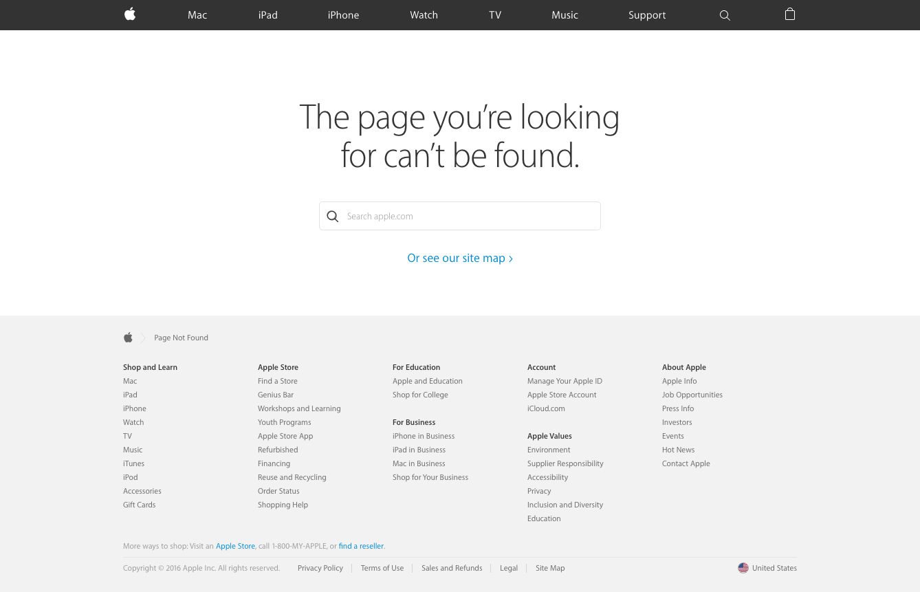
Sometimes the best way to design a 404 page is to keep it simple. Include a short header explaining the page, a search bar and a call to action. Apple also keeps its usual header navigation and footer information in place to make it easy to reach other parts of the site.
2. MailChimp – A subtle video and clear directions help users get back on track
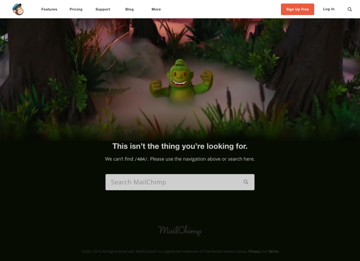
MailChimp is known for its chimp mascot, so what better way to ease the frustration of finding yourself on a 404 page than to include a familiar face? MailChimp also provides clear instructions and a search bar to find what you need.
3. Airbnb – This cute animation is having a rough day.
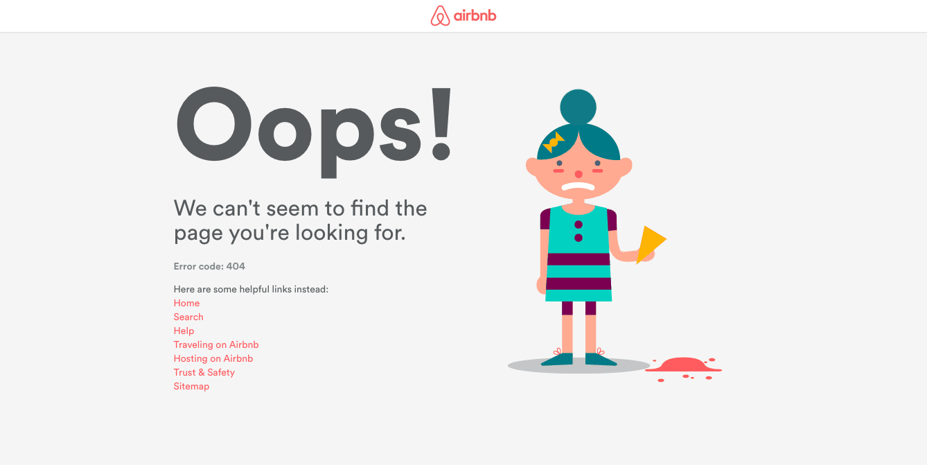
While it’s missing a search bar and the usual main navigation from the rest of the site, this 404 page is still helpful while also poking fun at itself. The copy on the page implies that this was an error on Airbnb’s part, and not the user. This is something that can help your users feel more comfortable with finding themselves on this page, and less like they made a mistake.
4. Github – Github knows its audience
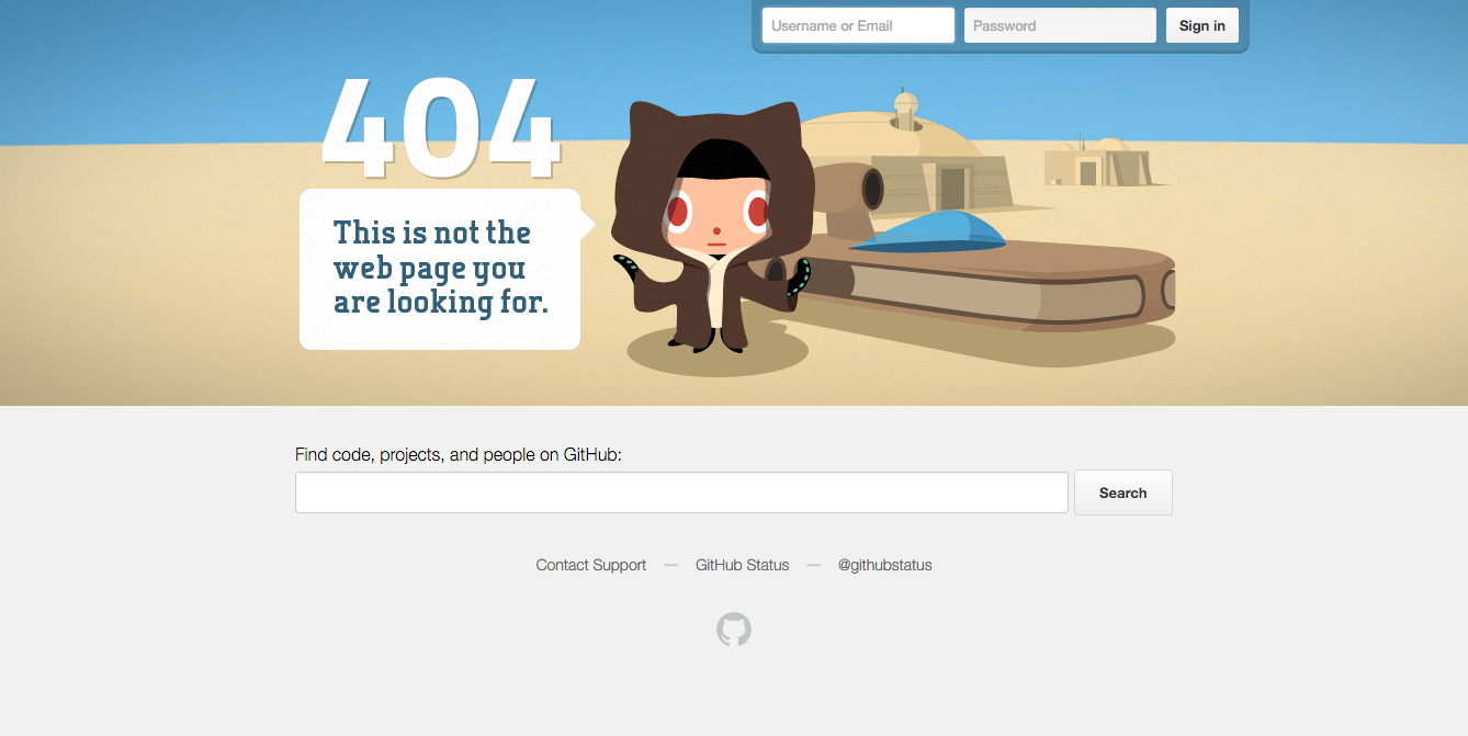 This obviously won’t apply to everyone, but if you’re very familiar with your user’s interests and hobbies, using pop culture references can really make your site more relatable. If your site has a log in area, providing a quick sign in on the 404 page is also a good idea since you can often find yourself on a 404 page if you somehow get signed out.
5. Vimeo – Clear calls to action get users back to the videos
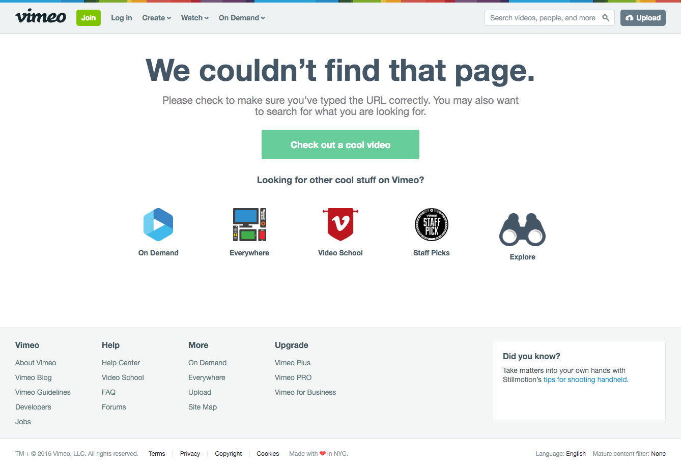 While it’s not humorous like the previously mentioned sites, Vimeo does a great job of offering the user many solutions to the 404 problem. A simple “Go back” button is a great feature to include since broken links are often the culprits of 404 pages. Vimeo also takes this opportunity to feature other parts of their site the user might not know about.
6. Starbucks – Own your mistakes and provide clear solutions
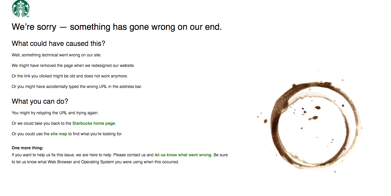
From a purely aesthetic standpoint, the Starbucks 404 page seems a bit dated; however the content is incredibly helpful and effective. Starbucks lays out a clear explanation of how you could’ve ended up on the page and provides multiple solutions. Perhaps some navigation at the top of the page would be helpful, but this is still a strong example how to provide your users with ways to get back to your content.
Like any other page on your site, you want to keep the branding consistent and the information on the page relevant so it’s not jarring to your visitors. Including a search bar on 404 pages is also a great way to get your users to interact with proper pages on the site, and might even help them find what they were originally looking for.
The reality is, you never want your site visitors to see your 404 page. In a perfect world, links would never be broken and everyone would type URLs without error. But, we all know that will never happen, so you might as well have fun with your 404 page and keep your users engaged! If you’re interested in more 404 pages, check out 404notfound.fr which features a ton of humorous and interactive 404 pages, and of course it has an amazing 404 page of it’s own.
Sign up to receive news, resources, and helpful content, sent straight to your inbox.
More Posts

Crisis Communication for Churches and Nonprofits: Navigating Challenges with Integrity

The Psychology of the First Donation: Why It Matters More Than You Think

Want More Traffic from Google? Here’s How to Create “Helpful Content"

What's New in Meta Ads & The Impact on Your Campaigns

How to Lose Your Job and Gain Your Life

How Nonprofits Can Use Digital Funnels to Grow Their Donor List

Why Your Organization Needs a Case for Support

Time to Rebrand? Five Indicators Your Organization Needs a New Identity

The 3 Cs of Hiring: Why Competence, Character, and Chemistry Matter Equally

Using AI to Grow Your Nonprofit or Church

Grow Your Church Using Google Grants