The Two Key Components to Every Brand
By The A Group

What are the two key components to every single brand?
If you’re one of our clients or listen to our podcast often, you likely already know the answer to this.
Two critical pieces when rolling out a brand (or rebranding an existing one) is to make sure it has effective messaging and a defined visual design (logo, brand standards, style guides, etc.).
In order to have the most impactful brand possible, you can’t have one component without the other. If you have a strong visual brand but a weak message, people will first be attracted to your brand, but then likely get lost on what it is you do exactly and bounce. And conversely, if you have a strong message and a weak visual brand, people may connect with what you do but considering the lackluster visuals, they may not consider you “up to par” to do what you say you’re going to do because of an outdated or less than excellent visual brand depiction.
So now that we’re all on the same page about both being important pieces to your brand puzzle, let’s talk more about why.
Messaging
Messaging tells the story of your brand, its promise and how you do what you do as an organization. Good messaging gives the user/client/donor/customer understanding of your unique promise to them and how you differentiate yourself. For example, consider a couple famous nonprofits and their effective positioning statements:
- St. Jude: Leading the way the world understand, treats and defeats childhood cancer and other life-threatening diseases.
- Charity Water: A nonprofit organization bringing clean and safe drinking water to people in developing countries.
Nothing too verbose, confusing or flowery – just clear and concise messages.
Note: To learn more about effective brand messaging, check out our blog post, What is Brand Messaging & Why Does it Matter?.
Design
Your brand’s design is a visual guide for your brand and helps those who interact with it to gain (often subconscious) contextual understanding of who you are. It helps the user to “feel.” In other words, it’s the heart language of your brand, where messaging is the head language. Let’s look at the same nonprofits listed above as they relate to logo design:
![]()
- St. Jude: the logo, for example, is the silhouette of a praying child. It is very emotive, indicates who they serve and even a state of being that jolts you to understand they may need help of some kind. Looking at color, the color red (in color psychology) ties to urgency and danger. Both of these visual components help communicate messages in non-verbal, yet impactful ways.
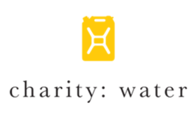
- Charity Water: The logo is a water jug, communicating a transport of water to some degree. The yellow (of the water jug) communicates relief, alongside joy and optimism. While the blue often seen in their secondary color palette depicts the component of water, peace and resolution.
Note: If you want to learn more about effective logos and whether or not your organization's logo is in need of a redesign, check out our blog post, Do You Need a New Logo?.
If you’re wondering what component should come first when developing your brand, we can help.
Messaging should always come first. Otherwise, you will likely have the “lipstick on a pig” syndrome where you’re trying to make something look attractive even though it’s not so pretty underneath the surface. Create a compelling message first and then good design will take that message and give it life, connecting both the heart and mind as people interact with your brand.
If you find yourself in need of a full brand overhaul, or even just a logo or messaging on their own, we’re here to help. We’ve helped countless nonprofits and ministries more clearly define their brand in order to make a bigger impact on this world. If you’re interested in learning more or chatting with one of our branding strategists, click here and we will be in touch.
Sign up to receive news, resources, and helpful content, sent straight to your inbox.
More Posts

Crisis Communication for Churches and Nonprofits: Navigating Challenges with Integrity

The Psychology of the First Donation: Why It Matters More Than You Think

Want More Traffic from Google? Here’s How to Create “Helpful Content"

What's New in Meta Ads & The Impact on Your Campaigns

How to Lose Your Job and Gain Your Life

How Nonprofits Can Use Digital Funnels to Grow Their Donor List

Why Your Organization Needs a Case for Support

Time to Rebrand? Five Indicators Your Organization Needs a New Identity

The 3 Cs of Hiring: Why Competence, Character, and Chemistry Matter Equally

Using AI to Grow Your Nonprofit or Church

Grow Your Church Using Google Grants